

Concept and Overview
Welcome to Gamer Army, a place designed by me for gamers and people who have interest about games. I do posts about games released lately, games I’ve played or I’m interested in and I would write them out in the form of a website post.
Because my site is aimed at people who like games, so no matter which age group or social class they are in, they are all welcomed to my website.
Actually, this brings a problem, there is so much gaming websites out there on the internet, if I want to attract my audiences’ attention, then what differs my website from the others? You see, from most of the gaming website I’ve been look into, they all have a similar pattern and structure. The way they used to attract their intended audience and articles they wrote have so much in common. Things they do for example like click baits, they put attracting images and titles to make you to click on it. As for the inside of the website, most of them are some announcement and introduction about a game. My website focus on my playthrough of the game and my thoughts and suggestions for my website.
Visual Communication and Design
First impressions are the most important thing when designing a website. When your audience clicks into your site, the first thing you would like to do is to use your site’s design to catch their eye immediately. Also, your websites’ layout, structure, and framework to grab their attention. In most gaming websites I’ve found, not only layout, articles and images are existing in the website, but also various kinds of ads. Like some pop-up ones can distract viewers’ attention away from an article very easily, and that’s not good. Clarity and simplicity are the first criteria when designing my site. It’s a basic standard for me because I want my audience to understand what I want to express through the elements of my website at the first sight. Images play an important role. If images are too fancy, then it will start to confuse people at the first time for not being able to grab the meaning you want to show in the image. So, I think simple images will be more attractive. Titles are important too. In my opinion, title differ from the use of image, they can be very simple, or fancy and funny. Because when people look at these kinds of gaming sites, one thing we can be sure of is that images will be the first thing that will grab their attention, and then are the headlines next to them. As for my website, I chose to use very clean background, you just need to scroll sown a little bit and you can get a full look into my website. A neat outlook would make my audience to absorb the things that I want to show better due to the quantity of the information and my design for the website.
User Interface Design
As for my layout and the structure of my website, I have already mentioned it in the paragraph above, I tried to keep it clean and simple, because in this way, my intended audience can absorb information better and faster.

As you can see from the image, the first thing you see is my header image (Designed by me) and a menu bar above. Then if you scroll down, is posts I wrote for some games I’ve played. Let’s pick one and have a deeper look at my post.

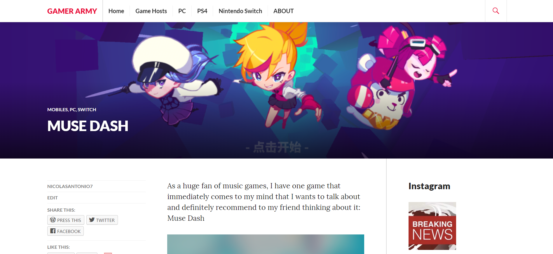
This post is about a music game I loved very much. It’s called “Muse Dash”. All of the images are screen shots taken by me, It is easy to see that I’ve put a lot of images about the game, and the content of the paragraphs are linked with the image. Then is the side bar on the side, for mine, I choose to use my Instagram account, in the side bar you can see some post like my recommendation for some games or some announcement sometimes. Then at the end of this article, I created a portal (hyperlink) to the game’s trailer you can click on. At the bottom of this page, is the comment section, and some link to my other articles.

The menu bar at the top (as you can see in every picture) is designed for gaming hosts, like PC and Nintendo and so on. It’s used to put hyperlinks to my article about games on specific gaming hosts including their own and other websites about it. What I am trying to do with my website design is to create a pattern for users to feel comfortable when visiting my website every time. (Johnson, 2014)
User Experience Design across Digital Platforms
Instagram is the one I choose as the sidebar on my website.

In this way, I have completed cross digital platforms by adding a social media reference in my website. Meaning that I have connected users’ experience cross platforms. User experience, UX, is a process of me doing research try to understand what my user thinks of my website (Marsh and Marzan, n.d.). In this case, I have connected my website, to their social media. In my case, because I am doing game related website, I release game related posts on Instagram. It’s usually a photo with a brief explanation, it should be as simple as possible for it is the sidebar which plays the role of being like a ad. Meaning that the users shouldn’t spent much time on reading that.
In which way the user would feel more related to my website, and meanwhile, sidebar actually made the user experience better. Social media is different form a website, the way to use them and convenience are different. Social media is used more nowadays for people are having more of their focus on their social media then a place like a website. So, it’s definitely a good idea to embed a cross platform part in the website.
Because I am providing only information on my website, and it is all from me, I am the producer, so I’m having a monopoly on my information. If my user wants to get more, they have to get it form me, meaning I have to make their experience better when visiting my site (Garrett, 2011).
Audience Metrics
Different from a product, user experience is much more important and valuable on the internet (Garrett, 2011).
With the development of my site I became to realize that it is important to get to know user’s experience and what they think of your site. Only with their comments and suggestions, you can improve. Let’s take a look at the data statistics of my website.

The first thing we see is an outstanding data: I got 42 views at 6th of May. I will be honest here; I have no idea what happened that day. It was so different from other data, for example in June, I got 3 – 4 views on average per day. But the only thing I knew is that after I made changes for my website, I got tons of views, that means I also received lots of user experience and get chances to hear their thoughts. It is not enough if you only make changes on your website based on the comments you get form the users, it’s also important to know the audience metrics, to look at the data and analyze it.
Future Directions and Development
The way to shape my website is based on the feedback I get from users to make changes. Besides that, I think I will just carry on, posting articles, and try to add new sections like videos for play through of a game or review videos, new types of article for example information about gaming equipment. Or even chatroom and see how it goes. Because my website is about games which I’ve been playing or I have interested in, there will be a problem if I do this by my own. I must know other’s opinion, what does other’s think about my website, and use that as the main force to push the development for my website.
Reference List:
Johnson, J. (2014). Designing with the mind in mind. Waltham, Mass.: Morgan Kaufmann.
Kress, G. (2010). Multimodality. London: Routledge.
Garrett, J. (2011). The elements of user experience. Johanneshov: TPB.
Marsh, J. and Marzan, J. (n.d.). UX for beginners.
Quesenbery, W. and Brooks, K. (2011). Storytelling for User Experience. Sebastopol: Rosenfeld Media.
